 Above: Hillshade spatial view with base layer.
 Above: Slope spatial view with base layer.
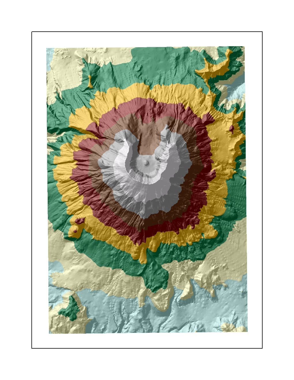
 Above: Aspect spatial view with base layer.
Above: ArcScene view with lookout point.
Above: Hillshade spatial view with base layer.Above: Slope spatial view with base layer.Above: Aspect spatial view with base layer. There are 1,367,445 acres of urban area in L.A. County. I used the clip overlay function to simplify the Urban Boundaries feature class.
 I used the dissolve tool to create a new feature class of all provinces.
  Above: All U.S. counties are ranked based on the concentration of self-reported ethnicity. Counties that reflect darker shading have higher concentrations of African-Americans. This data set, obtained in 1999, shows the highest levels of concentration in the Southeastern United States. Traditionally Southern states have the highest proportion of self-identified blacks, in which nearly half or more of the population is black. These states include Louisiana, Mississippi, Alabama, Georgia, South Carolina, North Carolina, Tennessee, Virginia and Maryland. While more diffuse, select counties in Florida, Michigan, Texas and California reported higher concentrations of blacks, nearly a quarter or more of the population. The breaks that the software created do not reveal the complexities of the differences in concentration between the 8.11% and 24.25% threshold and the 0.1% to 8.1% as well. This data set would be more revealing if contrasted, for example, with data from the 2010 Census.
 Above: Overall, concentration levels of Asians were lower than for Blacks; this was due in part to the fact that there are fewer Asians in the total population than Blacks. In 1999, highest levels of self-reported Asians were concentrated in the West, mostly in the states of California, Oregon, Washington, Alaska and Hawaii. Select areas in the Eastern United States also had concentrated populations of Asians: the New York region appears to have higher concentrations. The threshold, again, is too general to give insight into how these concentrated areas compare to one another. The range, 17.57% to 46.04% does not represent diversity as clearly. Perhaps inserting another tier, ranging from 35% to 46.04% would have better illustrated the distinction. Other regions that had more diffuse, but significant concentrations of Asians, were Florida, Texas, Michigan, Arizona, Nevada and Wisconsin. Again, contrasting this data with more recent data would show trends not currently visible.
  Above: Although somewhat ambiguous in its definition, this map reflects the distribution of respondents who identified themselves as "Some Other Race" in 1999. According to the 2000 Census, "Some Other Race" is an "other" category, reserved for self-reporting a race that is not represented by a given category within the survey. Because "Hispanic" or "Latino" is not a given category on the census (the only choices are White, Black or African American, Asian, American Indian or Alaska Native, Native Hawaiian or Pacific Islander, and some other race) this category is likely selected by people who self-identify as Latino. Within this category, there is the option to write in a race, such as Mexican, Puerto Rican, Cuban or some other self-reported race. Assuming that this is the primary group reflected in this map, the populations are concentrated in the Southwest, as well as the Northwest and Florida. The greatest concentrations (20.83% to 39.08%) are located in California, Arizona, New Mexico, Colorado and Texas. Washington, Kansas and Idaho also have a few counties that report relatively high concentrations.
  Above: Equidistant Map Projections preserve distance.from a given point.
 Above: Equal Area Map Projections preserve area.
 Above: Conformal Map Projections preserve angles.
Significance:
Map projections take a three-dimensional object, the earth which is a sphere, and project it onto a two-dimensional surface. Regardless of the method used, distortions always occur. This is why we different types of projections are used: equidistant projections preserve distance; equal area projections preserve area; and conformal projections preserve shape. No projection is perfect however, and depending upon the purpose of the map, the element that needs to be preserved must be identified. In preserving distance, often times, area and shape are sacrificed. This is true of the other two variables as well; therefore, different map projections serve specific purposes and should not be used for other purposes because they are inaccurate.
Perils:
Map projections can preserve area, shape, distance, scale or other factors. However, no map projection is perfect enough to preserve all properties. Because of this, distortion occurs. In changing the surface of the projections, different properties are preserved.
The conformal projections were the Mercator and the Gall Stereographic. The Mercator uses a cylindrical projection and is often used for navigation because it preserves linear scale and angle. However, it distorts shape and makes large objects seem larger than they are; the scale increases towards the poles. This is why Russia and Greenland, for example, appear inordinately large. The estimation of distance was inaccurate: standard error (the difference between the true value and the estimate divided by the true value and the result multiplied by 100) was 45.9%. The Gall Stereographic however, was far more accurate, with only 3.2% error. It projects the sphere onto a plane; it does not preserve angles, nor distances or areas of figures. It does preserve angles.
The equal area map projections were the Sinusoidal and the Mollweide. The Sinusoidal uses a pseudocylindrical projection to preserve scale along the Meridian. Area is preserved on the map. The error for the Sinusoidal projection was 16.9%. The Mollweide is also a pseudocylindrical projection that is often used to model the sky. It does not preserve angles or shape, only area. This is reflected in the curvature of the continents. Error for the Mollweide was 14.4%.
The equidistant projections were the Equidistant Conic and the Plate Caree. The Equidistant Conic is projected onto a cone and has equally spaced parallels. Area and angles are not preserved, only distances. Distortion increases below the equator. Error for the conic is 0.61%. The Plate Caree projection is a simple grid that spaces meridians and horizontals by circles of latitude. This map is highly inaccurate, but useful for thematic mapping, due to easy translation to pixels. The projection appears to be highly distorted horizontally; error is 46.8%.
Potential:
In representing distance from D.C. to Kabul, the most accurate map projection was the Equidistant Conic; it had the lowest value for standard error. The most inaccurate map projection was the Plate Caree, which had the highest error. If the time is not taken to make these comparisons among maps, reported data, such as distances, angles and area can be highly inaccurate. It is important to use projections that will best represent the properties studied.
